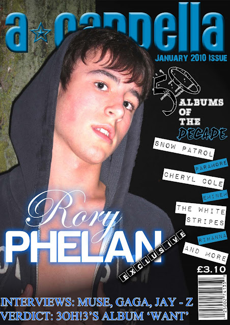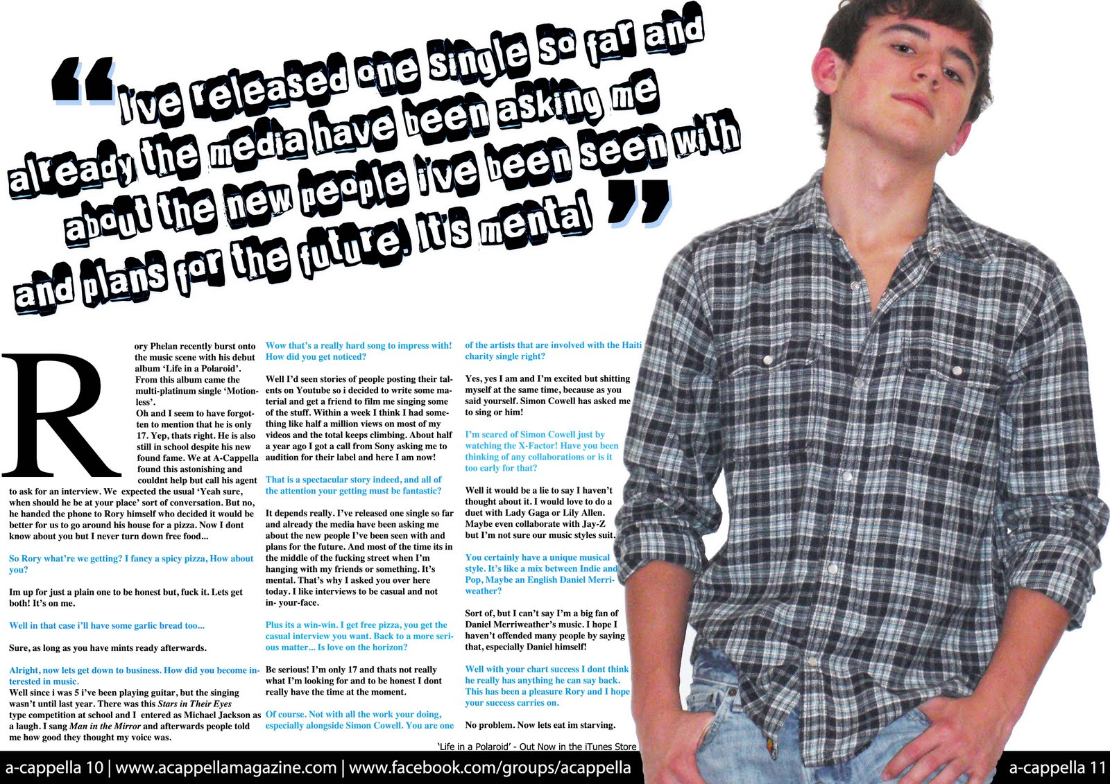

The preliminary task we were given was to create a front cover and contents page of a brand new school magazine. The picture on the front cover had to be taken ourselves and not taken from the school website. The specification of the picture was that it had to be a medium close up. The front cover itself had to include a masthead and some appropriately laid out text.
Analysis & Evaluation of Front Cover
The masthead on the front cover has the colour scheme of blue and gold - which is found on the WGSB school crest. The name 'Free Period' implies that the magazine is more aimed at sixth formers, as they are the only ones who get free periods. However, it would be possible for younger years to read it to catch up on school news during lunch or break times. The cover lines give a brief description of what is inside the magazine before a more detailed explanation from the contents page. They also attract the reader, as with the masthead, with their bold fonts and eye catching colours. The cover lines each have a different colour and font because this is a technique used by many magazines. Finally the photo was taken in a library of a student reading a book looking disappointed to suggest that studying isn't fun and the cover line 'Studying getting you down? 5 tips to make studying fun!' shows this is the main story and the magazine article will solve this problem.
Analysis & Evaluation of Contents Page
The contents page's colour scheme also has the blue and gold of the school crest. The title 'Free Period' has a drop shadow, as do the article headings, to make them stand out therefore attracting the readers attention. The background of the contents page is a navy blue and the description under each headline is a lighter blue, taken from the crest, which allows the description to stand out and keep to the school colours.


