


The first thing I did when i began the main task was looking at various magazines' front covers and analysing them (and stealing some ideas!)
Q Magazine
Producing Company - Bauer Media
Audience - 'Open-minded experience seekers, the Q audience don't define themselves by the music they listen to. Music is an important passion, but their love of music will never be to the detriment of their other passions, such as film, sport and comedy'
Cost - £3.90 for single copy or £46.80 for an annual UK subscription.
How often is it published? - Monthly
Circulation - 100,172
Cover Analysis
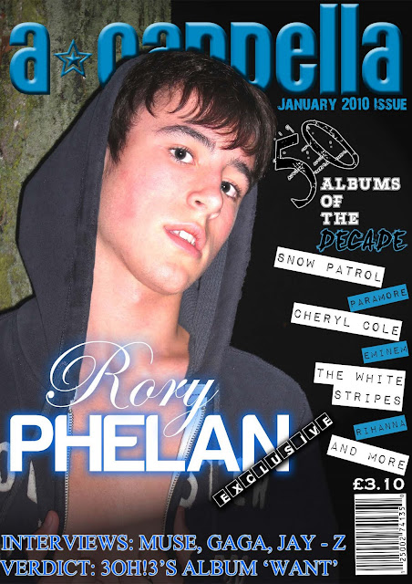
Title - 'Q' magazine. The original idea was for the magazine to be called 'Cue' as in the line 'cue the music'. However, so it wasn't confused with a snooker magazine they changed the name to 'Q'. Also as stated in the 200th issue, the producers believed that 'Q' would be more prominent than the original.
Masthead - The Q magazine logo is always in the same location on the cover the top left corner. The colour choice of red background and white text also remains the same throughout every issue so the reader can easily recognise the identity of the magazine. The red background causes the white 'Q' to look more vibrant, appealing to the audience.
Strapline - Though not used on every issue to allow space for the main image, like above, the Q magazine strapline is ‘A different take on music’. This implies that the magazine has its own unique way of displaying music to the masses compared to its rivals. With their target audience being ‘open minded’ this interests the reader as they should be willing to read about a broad variety of musical tastes.
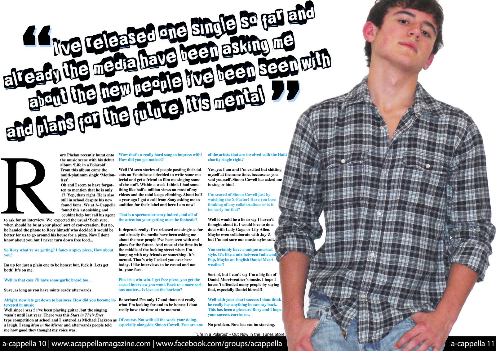
Main Image - The main image is a simple photo of the band Arctic Monkeys. However, there is no indication (excluding text) that they are a band of musicians. The band members are not holding their instruments and no microphones are involved. The expressions on each of the band members’ faces are serious and staring straight into the camera, giving the effect they are staring at the reader. The front man of the Arctic Monkeys, Alex Turner, is holding a Q Award trophy hinting that the Arctic Monkeys won a Q Award and that this issue will include an article about the event. Their clothing is nothing over the top and varies between each band member. Yet they all wear something that is considered normal clothing for the reader.
Cover Lines - The top cover line ‘the awards issue’ tells the reader that this issue is a special edition made specifically for the Q Awards winners, which is then backed up by the main text on the front cover ‘And the winners are…’ informing the reader of some of the winners but putting in ‘& more’ so the reader has to look inside the magazine to find out the rest. The cover line ‘Arctic Monkeys, on growing up the hard way’ also notifies the reader that there will be an article dedicated to the Arctic Monkeys including their childhoods up to the winning of their Q award. At the bottom of the cover there are two more cover lines. ‘Oasis’ Last Days: The Inside Story’ suggests the audience will be able to read information about Oasis’ last days never seen before. The second cover line at the bottom of the page ‘Robbie Williams Album Review’ informs the reader that plain and simply there will be a review of Robbie Williams’ latest album. Finally the cover line in the top right corner of the front cover ‘50 best albums of 2009’ suggests an overview of the year’s best albums.
Typefaces - The front cover’s fonts are generally quite tidy, similar to Times New Roman in style. This connotes that this issue of Q will be a formal issue. In the cover line ‘the awards issue’ the word ‘the’ is in italics, inciting that this is the only place to find out the winners of all of the Q awards. The two cover lines at the bottom of the front cover have a font which is quite narrow with a golden outline, disallowing them to stand out as much as the main headlines which have a much more bold and thick font. The cover line ‘50 best albums of 2009’ has a bold, black font excluding the ‘50’ which has a thin, red font and is larger than the rest of the cover line.