Dan 'Big Dan' Myles

Friday 26 February 2010

Double Page Spread Research


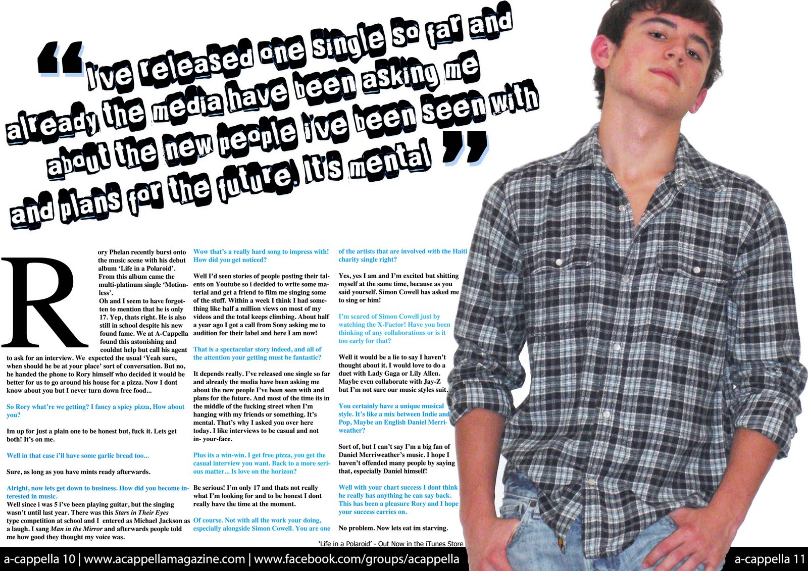
There are many variations of double page spread interviews within magazines. However, most of them use a base idea of a large picture taking up most or all of one page and then the other page for the text. In my opinion this is the best way to go about it because you can then clearly see who the interview is about. Also there are two main ways of writing the interview. It can be a simple Question and Answer session or it can be a flowing piece of creative writing with questions embedded into it. With many of the Question and Answer pages the question text's colour and font is normally different from that of the answer. Also, in most of the double page spreads i have seen so far at least one of the paragraphs (normally the first) has its first letter larger than the rest.

Monday 1 February 2010

Front Page Development


To start with I rendered the original photo using lighting effects to brighten it up and to make it look like it was taken in a studio. I then added the barcode, price and masthead. To get the mast head behind part of the photo I put it onto a new layer and then erased the bit I did not want to see. I then placed the main story's cover line on the front with the fonts I thought would have the better aesthetic value, followed by giving 'Rory' a red drop shadow and 'PHELAN' a red outer glow. I also wrote 'EXCLUSIVE' in box text over the top of the cover line to show the importance of the story. After that I placed two other cover lines along the bottom of the page with blue text and a white outer glow. Penultimately I placed the '50 albums of the Decade' headline onto the cover, using a variety of sizes and colours within the fonts, which is a technique used by many professional music magazines. Lastly I listed, down the right hand side of the front page, various artists who feature in the magazine. This was going to be my final cover, however after some discussion and comments by classmates I decided to change the red to blue, because it complemented the picture better.

Final Magazine Front Page