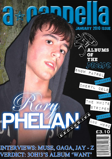
This front cover is extremely well presented with it's own individuality. The use of the blues and whites complement the image which in itself is of high quality. The masthead is easily recognizable with it's embossing and inner bevel. The cover lines are the sort of stories you would see on a normal magazine. The vast array of fonts and font sizes easily distinguish the main stories over the minor ones which enables the reader to identify stories of greater importance. Overall I believe the front cover can easily be recognized as a top quality music magazine!!!
Yo Big Dan. I'm loving the cover pic, it's very sexy indeed. I think the drop shadow you've applied is very effective, as the way it goes over the mag title makes it look like he's actually standing in front of it.The white and blue boxes with the band names in are also very nice. The one thing I'm not too sure about is the 50 used on the "50 albums of the decade". In my opinion it's a bit overly ornate for my liking, and despite looking cool it's slightly off-putting. Anyway, just my opinions, regard them as you see fit.


2 comments:
This front cover is extremely well presented with it's own individuality. The use of the blues and whites complement the image which in itself is of high quality. The masthead is easily recognizable with it's embossing and inner bevel. The cover lines are the sort of stories you would see on a normal magazine. The vast array of fonts and font sizes easily distinguish the main stories over the minor ones which enables the reader to identify stories of greater importance. Overall I believe the front cover can easily be recognized as a top quality music magazine!!!
Yo Big Dan.
I'm loving the cover pic, it's very sexy indeed. I think the drop shadow you've applied is very effective, as the way it goes over the mag title makes it look like he's actually standing in front of it.The white and blue boxes with the band names in are also very nice.
The one thing I'm not too sure about is the 50 used on the "50 albums of the decade". In my opinion it's a bit overly ornate for my liking, and despite looking cool it's slightly off-putting.
Anyway, just my opinions, regard them as you see fit.
Post a Comment