


Placing my preliminary task alongside my main task just shows how much I have learnt over the course of the construction of my product. Even if the main ideas have stayed the same (e.g. image in front of masthead), they have developed in quality. The addition of effects, such as lighting and drop shadows, just show how much I have discovered when using the photoshop software.
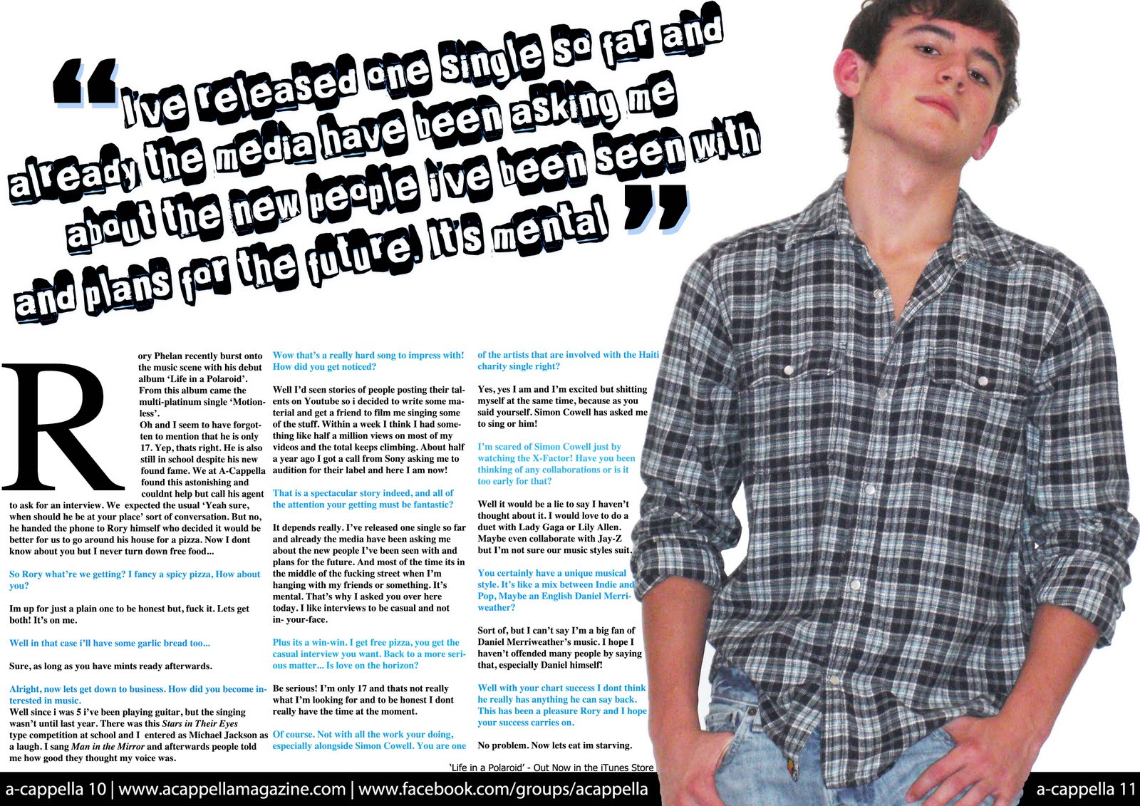
It isn't just how to create something that I have learnt along the way, I have also learnt just how long it takes to create something. For example, choosing fonts and colours can take forever before you get just the right 'shade of blue' or the right 'shape of font'. This can take anything from twenty minutes to an hour - which is valuable time gone. I have also learnt how different photo poses are used for each of the tasks. For example in the preliminary task it wouldn't be appropriate for the student to be looking at the camera with the same gaze as Rory from my main task, and vice versa. Props are important aswell, because using a book in the music magazine (or using headphones in the school magazine) would be pointless as it has nothing to do with the magazine's theme.

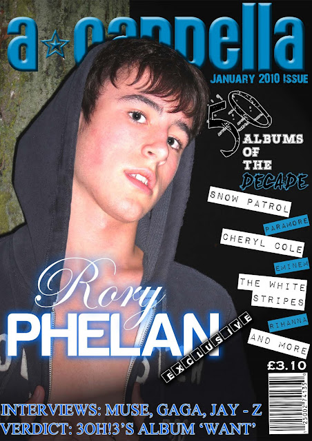
I have developed my ability to use photoshop throughout this course - especially since I mostly used indesign to create my preliminary task. The choices you have in photoshop to create various looks are amazing, burn tools, lighting effects, paint brushes, font effects etc. As you can see in my preliminary task I used none of these and the quality of this magazine is very low. However, I used various effects in my main task such as drop shadows, outer-glows and lighting effects to give the magazine a much better quality finish.

I admit though, using InDesign during my preliminary task gave me many more choices in terms of text options, e.g. text wrapping - which I did not use in my main task. I chose to stick with photoshop after getting used to it and used the pen tool to create an outline to text wrap which, when I look back, was a really long-winded approach.
Looking at the difference between the main task magazine contents page and the preliminary task contents, you can quite clearly see what I have learnt in terms of layout and content. Even though it has a slightly messy look it looks much more organised than the school magazine which the headings and descriptions equally spaced out, the font sizes are appropriate and a photo was used - just like many magazines. The fonts in my preliminary magazine do not really seem to have anything to do with school whatsoever, also they seem cartoonish - givng them an immature feel which is definately not a signal the leadership team of a school want a school magazine to put across.
What I have learnt along the way is greatly thanks to the research I have done about music magazines (their layout, images, fonts and content) giving me a much more vivid picture in my head of what I wanted my magazine to look like and how it would keep to the conventions of other magazines. That is why there is such a difference when comparing the two magazines side by side, because before my preliminary task I did next to nothing in terms of research.
No comments:
Post a Comment