

During the construction of my media product, A-Cappella Magazine, I used various conventions and layouts that are seen on many music magazines today (e.g. Q magazine and VIBE). As shown in the picture on the left various aspects of my magazine front cover fit the standard form of a music magazine front cover.
Title
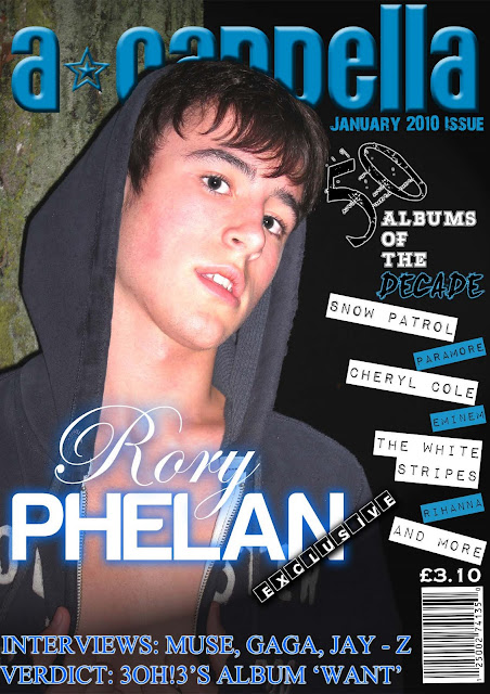
The title of my magzine 'A-Cappella' conforms to the type of language used for popular music magazine titles. They all have a musical meaning such as 'Q' which was "Originally 'Cue' as in the phrase 'Cue the music' or 'Cueing a record'". In comparison VIBE could relate to two things; the feeling or 'vibe' a certain song gives you, or the vibrations needed for sound to be heard. Also i believe that the title of my magazine needed to be unique so people would remember it. 'A-Cappella' provided me with the originality I required andm as shown in my name ideas post, people have said it's a smooth sounding phrase. The only criticism 'A-Cappella' recieved is that it isn't 'short and sweet' like manay magazine titles today, but I believe because of this it will stand out from the rest.
Genre/Artist/Mise-en-Scéne
The genre I chose to use for my magazine was the Indie-Pop genre. I chose this because this genre has a large gap in the market and it is a genre rising in popularity. The photos I took to use in my magazine all fit the conventions of this genre and those of magazines in general.
 The look I was going for was a mix between solo artist Daniel Merriweather and Luke Pritchard who is the lead singer of the band 'The Kooks'. These artists are extremely popular and I believe this will attract a wide audience to my magazine. The outfit I asked my model to wear was a variety of checked shirts, a pair of jeans and a casual hoody - popular clothing among this genre.
Fonts
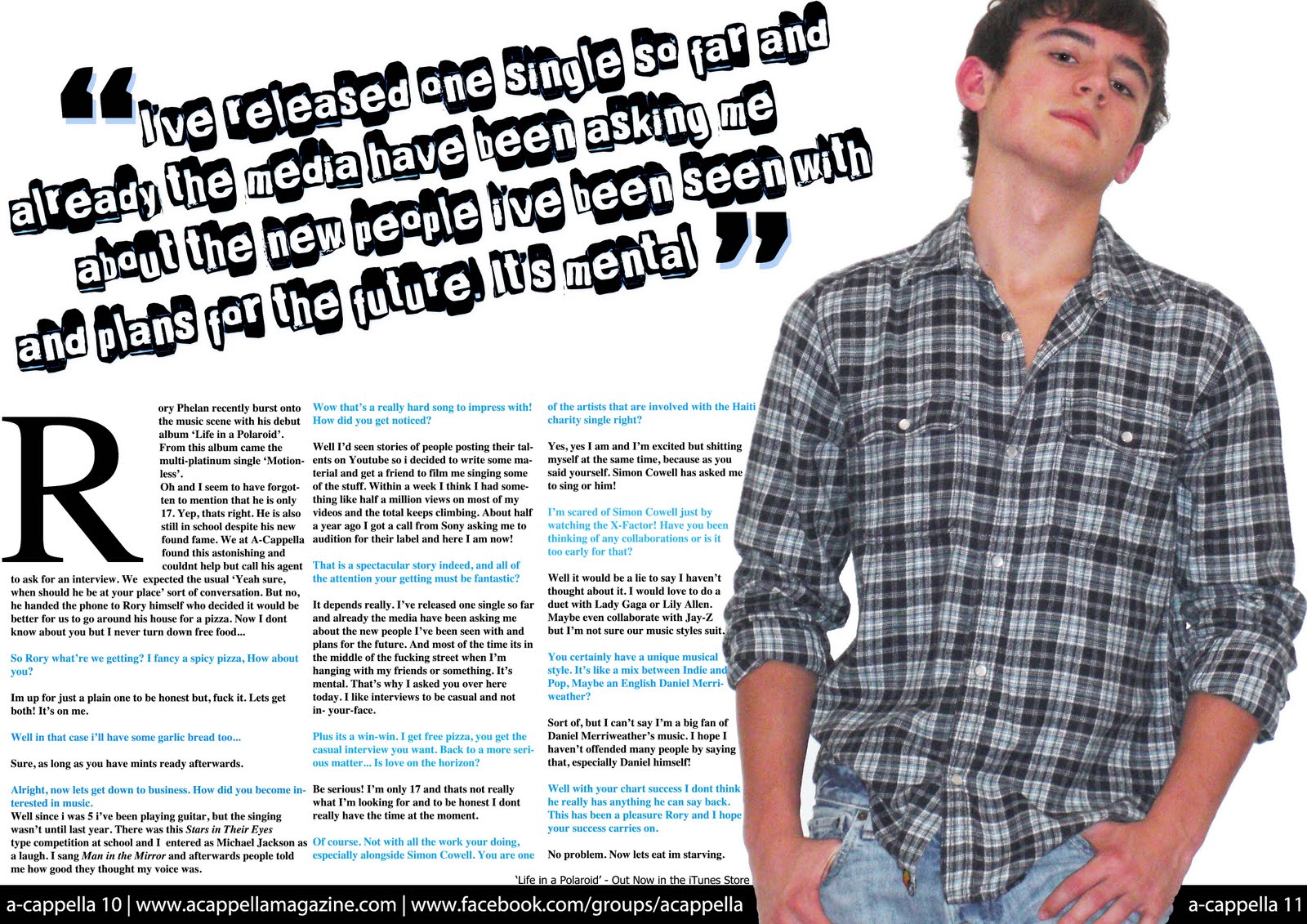
I have used a variety of fonts, most of them being fairly neutral to any genre. The variety of fonts on my front cover, contents page and double page spread conform to how fonts are used in many music magazines. A variety of fonts are used to created originality within a magazine, for aesthetic value (attracting the audience) and to show the emotion in what is being said. In my double page spread the font 'Punk's not dead'is used for the quote at the top of the page, giving it a 'messy' look and portraying the emotion of anger or confusion.

The fonts used for the main cover line on many magzines are usually varied and of a large size. On my magazine I used a white script font with a blue drop shadow for 'Rory' and a white block font with a blue outer glow for 'Phelan' - as shown in the picture below.

The glow of these fonts let it stand out from the rest of the cover - helping it maintain it's status as the main story. Also the colour of these complement the image used in the front cover - again shown in the image below.

Contents Page
The contents page in my magazine conforms to the usual aspects of a music magazine contents page.

In the above image you can clearly see the similarities between my contents page (top left) and the other two. Each have a large picture which the text centres around and this image is usually about the main story (A-Cappella & Q magazines : Interview with artists. NME magazine : 'The end of the Astoria'). Most standard contents pages in music magazines have a banner at the top of the page stating that it is the contents page. My magazine follows that convention as shown in the image below.
 You can quite easily see the similarities between the banners - especially with Q. The only majour difference is that NME says 'This Week' instead of Contents, but they mean the same thing in this context. The use of neat columns give the reader an easy view of what is included in the magazine, which is why I used the idea for my magazine.
 This is the same for the large photo on the contents page. I thought it fitted quite well into the layout of the contents pages, so I decided to use that idea also.
I conclusion, by comparing my magazine side by side with a couple of popular music magazines you can clearly see that my magazine uses the forms and conventions of real media products. This includes fonts, layout and images.
No comments:
Post a Comment