

Friday 12 March 2010
Monday 8 March 2010
Evaluation Question 6
What have you learnt about technologies from the process of constructing this product?


This gave the image substantially better quality as it looks like it was taken in a studio photo shoot. You can see the difference by viewing my original photos and my finished front cover I could use Photoshop to put effects on text to give them a greater aesthetic value, thereby attracting my audience. Examples of these texts can be see throughout my media products as shown in the image below.
 The text effects used were a mix between outer-glows, drop shadows, bevels, embosses and just simple size adjustments. This again allowed me to get the best quality out of what I was trying to manipulate - making it more attractive.

During the course of the construction of my media product, I have learnt a lot about the technologies involved - especially Photoshop.
When practicing magazine construction (the preliminary task) I used primarily InDesign. I personally did not like this software very much as it gave me limited options in terms of effects and image manipulation. This is why I switched over to Photoshop when constructing my main task.I took the photos using a 12 mega pixel Kodak compact digital camera. This allowed me to get the best quality pictures in short notice without using a professional camera. Photoshop then allowed me to edit my photos how I wanted, especially the front cover image which was in serious need of a lighting effect as shown in the image below.

 The text effects used were a mix between outer-glows, drop shadows, bevels, embosses and just simple size adjustments. This again allowed me to get the best quality out of what I was trying to manipulate - making it more attractive.
Evaluation Question 5
How did you attract/address your audience?
During the previous evaluation question, I discussed what sort of people make up my target audience. In this evaluation question, the techniques used to attract my audience will be brought foward. However, as stated in question 2, other audiences need to be attracted besides the main audience due to topics such as news within my magazine, which may affect different social groups.
Images
The main way I tried to attract my audience was by

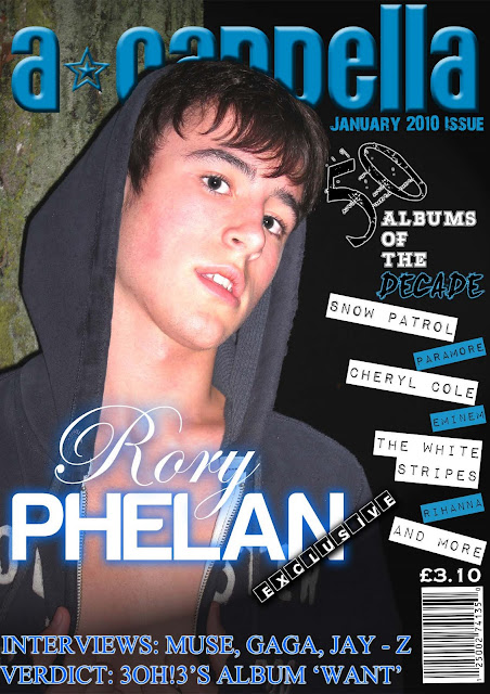
the images throughout the magazine of my artist, Rory Phelan. A female or homosexual audience would be interested in my magazine due to the fact that they may find my artist attractive. Also, a straight male audience may be interested in Rory because they may admire/idolise him. The clothes he is wearing are fairly neutral and normal, therefore relating to my target audience because he is not wearing anything over the top like many artists nowadays - such as Lady GaGa. They also belong to the 'Hollister' brand, a high street shop, which many people may have in common with him. Also his gaze enagages the audience as if he is looking directly at the reader, we could even say (in an extreme) that he is hypnotising my audience into reading the magazine.

The image used in the contents also relates to my audience in terms of costume and props. Rory is wearing a checked shirt and a pair of jeans - both from Topman, another high street clothes chain. This is an extremely popular brand which most of the audience can relate to (the sister brand being Topshop for women). Also the headphones he is wearing are from the 'Skullcandy' brand. These headphones are extremely popular among teenagers because of their unique looks and their impressive bass enhancing technology - with the bass of music being an important aspect of songs recently.
Cover Lines

'50 Albums of the Decade' should attract my audience to my magazine because they should have been alive for the 2000 - 2010 decade. Therefore they should be interested what albums made it into the top 50 because it is music that has defined most of their lives. Even if this decade does not relate to the audience (for example the 30+ people who may not particularly enjoy much new music) they may be interested just to see who came top.
The main cover line 'Rory Phelan Exclusive' should attract my audience. Exclusive means that only this magazine has an interview Rory Phelan, therefore the fans will purchase only my product if they want to read about him, which they will because of the type of artist he is. Also the story linked to the main cover line has content that will relate to my audience and will interest my audience - such as Rory's rise to fame and how he is coping with the media attention.
Colours
The colours used throughout my media product are black, white and blue. These colours are extremely neutral colours (despite the generalisation of blue for boys and pink for girls) therefore both genders will be attracted to my magazine. The colours also work with the cover image and the main images on the contents page and double page spread - giving it a greater aesthetic value.
This mix of imagery, content and colours all add up to a means of attracting my audience. It should work effectively due to many other magazines using the same techniques.
Evaluation Question 4
Who would be the audience for your media product?
In the second evaluation question I described the social group that my magazine was aimed at. I also described in question 3 about which media institution my magazine would fit into. Therefore my audience would be someone who is an all-round music lover (leaning towards the indie genre) who has the same sort of views as those from Bauer media's audience. To be more exact it would be more similar to Q Magazine's audience because Kerrang!'s audience wouldn't be appropriate for my magazine genre. As discussed in my detailed analysis of Q magazine, their audience are 'Open-minded experience seekers, the Q audience don't define themeselves by the music they listen to. Music is an important passion, but their love of music will never be to the detriment of their other passions, such as film, sport and comedy'. I also want my audience to be open minded and not to define themselves by the music they listen to. This also points towards a more mass audience as opposed to a niche audience. Being similar to Q's audience is key though, not exactly like Q's audience because otherwise the magazine would be pointless.
Age
The age my magazine is aimed it is young adults between the age of 16-21. They are interested in a variety of music artists such as the obvious mainstream artists Lady GaGa and Jason Derulo. There is also a place in my audience for the slightly older (30+) person, because there are always people willing to try and keep with what is popular at the moment.
Musical Preferences
 my audience are more expsosed to them. This popular music is attractive for my audience but they should tend to lean towards the Indie genre from time to time. Indie/Independant music should relate back to their audience, implying that an indie music fan is independant and doesn't hesitate when offered tickets to concerts such as Reading or V festival.
Economic Group
 As mentioned in question 2, the class my audience is aimed at is the middle class. But to be more exact they fit into a particular social economic group. The picture on the left shows the descriptions of the social economic groups (A, B, C1, C2, D and E). In theory I believe my audience fit into the C1-D groups because these 3 groups include jobs normally maintained by the middle classes. However this is unrealistic because it doesnt matter how much money you have or if you have a job as to whether you are interested in purchasing music magazines - it is about what your personal interests are.
In the second evaluation question I described the social group that my magazine was aimed at. I also described in question 3 about which media institution my magazine would fit into. Therefore my audience would be someone who is an all-round music lover (leaning towards the indie genre) who has the same sort of views as those from Bauer media's audience. To be more exact it would be more similar to Q Magazine's audience because Kerrang!'s audience wouldn't be appropriate for my magazine genre. As discussed in my detailed analysis of Q magazine, their audience are 'Open-minded experience seekers, the Q audience don't define themeselves by the music they listen to. Music is an important passion, but their love of music will never be to the detriment of their other passions, such as film, sport and comedy'. I also want my audience to be open minded and not to define themselves by the music they listen to. This also points towards a more mass audience as opposed to a niche audience. Being similar to Q's audience is key though, not exactly like Q's audience because otherwise the magazine would be pointless.
Age
The age my magazine is aimed it is young adults between the age of 16-21. They are interested in a variety of music artists such as the obvious mainstream artists Lady GaGa and Jason Derulo. There is also a place in my audience for the slightly older (30+) person, because there are always people willing to try and keep with what is popular at the moment.
Musical Preferences

My magazine's audience is open to most music tastes and are willing to listen to anything that is popular at the time. The album covers on the right show the types of music my audience should be willing to listen to. This is because my audience is a mass audience and not a niche audience who are attatched to a single genre. The music genres presented by the artists on the right only have one thing in common - popularity. Therefore they get more airtime so
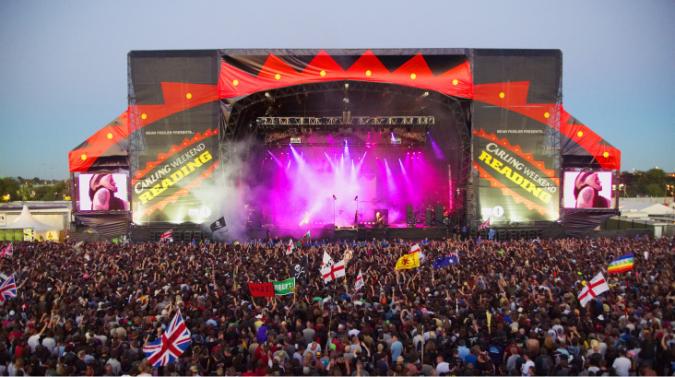 my audience are more expsosed to them. This popular music is attractive for my audience but they should tend to lean towards the Indie genre from time to time. Indie/Independant music should relate back to their audience, implying that an indie music fan is independant and doesn't hesitate when offered tickets to concerts such as Reading or V festival.
 Economic Group
 As mentioned in question 2, the class my audience is aimed at is the middle class. But to be more exact they fit into a particular social economic group. The picture on the left shows the descriptions of the social economic groups (A, B, C1, C2, D and E). In theory I believe my audience fit into the C1-D groups because these 3 groups include jobs normally maintained by the middle classes. However this is unrealistic because it doesnt matter how much money you have or if you have a job as to whether you are interested in purchasing music magazines - it is about what your personal interests are.
In conclusion my audience would be mainly aged 16-21, have a music preference leaning towards the indie genre, but willing to listen to most musical tastes and be in the social economic groups of C1-D.
Evaluation Question 7
Looking back at the preliminary task (the school magazine task), what do you feel you have learnt in the progression from it to the final product?


Placing my preliminary task alongside my main task just shows how much I have learnt over the course of the construction of my product. Even if the main ideas have stayed the same (e.g. image in front of masthead), they have developed in quality. The addition of effects, such as lighting and drop shadows, just show how much I have discovered when using the photoshop software.
It isn't just how to create something that I have learnt along the way, I have also learnt just how long it takes to create something. For example, choosing fonts and colours can take forever before you get just the right 'shade of blue' or the right 'shape of font'. This can take anything from twenty minutes to an hour - which is valuable time gone. I have also learnt how different photo poses are used for each of the tasks. For example in the preliminary task it wouldn't be appropriate for the student to be looking at the camera with the same gaze as Rory from my main task, and vice versa. Props are important aswell, because using a book in the music magazine (or using headphones in the school magazine) would be pointless as it has nothing to do with the magazine's theme.

I have developed my ability to use photoshop throughout this course - especially since I mostly used indesign to create my preliminary task. The choices you have in photoshop to create various looks are amazing, burn tools, lighting effects, paint brushes, font effects etc. As you can see in my preliminary task I used none of these and the quality of this magazine is very low. However, I used various effects in my main task such as drop shadows, outer-glows and lighting effects to give the magazine a much better quality finish.

I admit though, using InDesign during my preliminary task gave me many more choices in terms of text options, e.g. text wrapping - which I did not use in my main task. I chose to stick with photoshop after getting used to it and used the pen tool to create an outline to text wrap which, when I look back, was a really long-winded approach.
Looking at the difference between the main task magazine contents page and the preliminary task contents, you can quite clearly see what I have learnt in terms of layout and content. Even though it has a slightly messy look it looks much more organised than the school magazine which the headings and descriptions equally spaced out, the font sizes are appropriate and a photo was used - just like many magazines. The fonts in my preliminary magazine do not really seem to have anything to do with school whatsoever, also they seem cartoonish - givng them an immature feel which is definately not a signal the leadership team of a school want a school magazine to put across.
What I have learnt along the way is greatly thanks to the research I have done about music magazines (their layout, images, fonts and content) giving me a much more vivid picture in my head of what I wanted my magazine to look like and how it would keep to the conventions of other magazines. That is why there is such a difference when comparing the two magazines side by side, because before my preliminary task I did next to nothing in terms of research.
Evaluation Question 3
What kind of media institution might distribute your media product and why?

I had a limited choice of institutions due to the fact that the UK music magazine industry is dominated by two media institutions - Bauer Media and IPC Media. Therefore it was difficult to decide between the two because of experience and expertise.
Throughout this project I have been looking at two magazines that compare to my product in a similar way - Q magazine and NME. It just so happens that one is from Bauer Media (Q magazine) and the other is from IPC.
 Bauer Media
A summary from their website.
"Bauer Media reaches over nineteen million UK adults across multiple media channels. We have more than eighty influential media brands spanning a wide range of interests, including heat, GRAZIA, Closer, MCN, FHM, Parker's, MATCH, Magic 105.4, Kiss 100, Kerrang!, 4Music and the Big City Network, our group of twenty local radio stations.
Our business is built on millions of personal relationships with engaged readers and listeners. We connect audiences with compelling content, whenever, wherever, and however they want. Our unique insight allows us to work closely with our customers to develop innovative solutions that create a difference to their business"

IPC Media

IPC Media

"IPC Media produces over 85 iconic media brands, with our print brands alone reaching almost two thirds of UK women and 44% of UK men – almost 27 million UK adults – while our online brands collectively reach 20 million users every month.
IPC's diverse print and digital portfolio offers something for everyone, with a focus on three core audiences: men, mass market women and upmarket women.
Our men's portfolio (IPC Inspire) comprises a wealth of leisure brands including Country Life, Horse & Hound, Rugby World and Decanter, as well as lifestyle brands including Nuts, Mousebreaker and NME."
 In conclusion of these two summaries I believe Bauer media would be the most fitting institution to take on my magazine. They have the credentials to make this magazine great and their products (such as Q and Kerrang!) are of a similar style to my product. Q Magazine is a general music magazine and Kerrang! a rock magazine, therefore there is a market to produce my indie-based magazine.Another factor is their circulation numbers. It beats IPC hands-down with its weekly magazines (Kerrang!'s circulation is 43,253 while NME's circulation is 40,948) and it's monthly magazines also have a greater circulation than IPC's by about 20,000.
 The image above shows my magazine in comparison with Bauer Media's Kerrang! and Q magazines. I believe it fits well as a brand in this institution and it's successes with circulation of it's magazine means many sales would be made.
Evaluation Question 1

During the construction of my media product, A-Cappella Magazine, I used various conventions and layouts that are seen on many music magazines today (e.g. Q magazine and VIBE). As shown in the picture on the left various aspects of my magazine front cover fit the standard form of a music magazine front cover.
Title
The title of my magzine 'A-Cappella' conforms to the type of language used for popular music magazine titles. They all have a musical meaning such as 'Q' which was "Originally 'Cue' as in the phrase 'Cue the music' or 'Cueing a record'". In comparison VIBE could relate to two things; the feeling or 'vibe' a certain song gives you, or the vibrations needed for sound to be heard. Also i believe that the title of my magazine needed to be unique so people would remember it. 'A-Cappella' provided me with the originality I required andm as shown in my name ideas post, people have said it's a smooth sounding phrase. The only criticism 'A-Cappella' recieved is that it isn't 'short and sweet' like manay magazine titles today, but I believe because of this it will stand out from the rest.
Genre/Artist/Mise-en-Scéne
The genre I chose to use for my magazine was the Indie-Pop genre. I chose this because this genre has a large gap in the market and it is a genre rising in popularity. The photos I took to use in my magazine all fit the conventions of this genre and those of magazines in general.
 The look I was going for was a mix between solo artist Daniel Merriweather and Luke Pritchard who is the lead singer of the band 'The Kooks'. These artists are extremely popular and I believe this will attract a wide audience to my magazine. The outfit I asked my model to wear was a variety of checked shirts, a pair of jeans and a casual hoody - popular clothing among this genre.
Fonts
I have used a variety of fonts, most of them being fairly neutral to any genre. The variety of fonts on my front cover, contents page and double page spread conform to how fonts are used in many music magazines. A variety of fonts are used to created originality within a magazine, for aesthetic value (attracting the audience) and to show the emotion in what is being said. In my double page spread the font 'Punk's not dead'is used for the quote at the top of the page, giving it a 'messy' look and portraying the emotion of anger or confusion.

The fonts used for the main cover line on many magzines are usually varied and of a large size. On my magazine I used a white script font with a blue drop shadow for 'Rory' and a white block font with a blue outer glow for 'Phelan' - as shown in the picture below.

The glow of these fonts let it stand out from the rest of the cover - helping it maintain it's status as the main story. Also the colour of these complement the image used in the front cover - again shown in the image below.

Contents Page
The contents page in my magazine conforms to the usual aspects of a music magazine contents page.

In the above image you can clearly see the similarities between my contents page (top left) and the other two. Each have a large picture which the text centres around and this image is usually about the main story (A-Cappella & Q magazines : Interview with artists. NME magazine : 'The end of the Astoria'). Most standard contents pages in music magazines have a banner at the top of the page stating that it is the contents page. My magazine follows that convention as shown in the image below.
 You can quite easily see the similarities between the banners - especially with Q. The only majour difference is that NME says 'This Week' instead of Contents, but they mean the same thing in this context. The use of neat columns give the reader an easy view of what is included in the magazine, which is why I used the idea for my magazine.
 This is the same for the large photo on the contents page. I thought it fitted quite well into the layout of the contents pages, so I decided to use that idea also.
I conclusion, by comparing my magazine side by side with a couple of popular music magazines you can clearly see that my magazine uses the forms and conventions of real media products. This includes fonts, layout and images.
Evaluation Question 2
How does your media product represent particular social groups?
As discussed in the first evaluation question my magazine centres around a particular genre - Indie-Pop. This means that mostly fans of the Indie music genre will read this magazine. However, I do not consider my magazine to be aimed at a niche audience but a mass audience because I believe this type of music can be enjoyed by many - as it has evolved from various genres (e.g rock and pop).It is also aimed at a particular age group (mid teens to early twenties) and a particular class (middle class).

On the right is an NME magazine front cover showing the representation of the Indie genre through the group 'The Maccabees'. The two photos on the left are two I used in my media product. My artist has an extremely similar fashion and hairstyle to the band members of 'The Maccabees', showing that my artist also represents the Indie music genre in a similar way.
The gaze of 'The Maccabees' is straight at the camera like all magazines. However, it is a casual gaze at the camera - not a stare. This is the type of look I tried to recreate with the first photo. In my second photo, my artist's gaze actually is a stare. This may not fit the usual look for this genre but for the mise-en-scéne of the photo it is relevant and probably more appropriate.
However, despite being aimed towards the Indie group, topics such as News will need to be covered within my magazine which may affect other social groups. Therefore I also needed to attract other social groups to my magazine - by listing various other artsits from different genres, such as Cheryl Cole and Eminem.

Age
The age group of my magazine is from the ages of around 16 to 21. This means that a wide variety of groups will be reading my magazine. Firstly because 16 -18 y
 ear olds are still in school or have low-paid jobs the magazine needed to be affordable, therefore the price of the magazine is an appropriate price of £3.10. This price means that more people of a younger age will be willing to buy my magazine. The language of my magazine is for an audience mature enough to cope with casual swearing in a certain context ('fuck it' and 'shitting myself' etc), but not so mature that they look down upon swear words altogether.
However, I am aware there are many 30+ year old people who read music magazines in a bid to keep with what is popular at the time and to mix it up with the music which was around when they were 16. Therefore I had to keep their views in mind when creating this product.
Class
The audience's class also relates to the price. If someone is looking for a more expensive magazine than my price they are most probably in the higher class. My magazine may not be available to the lower class but there are plenty of weekly magazines (NME and Kerrang!) that cost around £2.20.
To come to a verdict, the social group my magazine most represents is a middle class, young adult between the age of 16-21 who loves all music but leans more towards the Indie genre.
Subscribe to:
Posts (Atom)